In data analytics, 2024 is poised to usher in a transformative wave of innovation, particularly in data visualization tools. These tools are the vanguard of modern analytics, bridging the gap between raw data and actionable insights with unprecedented sophistication and precision. As businesses and individuals grapple with increasingly complex datasets, the demand for intuitive and powerful visualization solutions has never been greater.
Amidst this backdrop, the landscape of data visualization tools is undergoing a profound evolution characterized by a surge in sophistication and capabilities. These tools serve as the linchpin of informed decision-making, enabling stakeholders to navigate the intricacies of data with confidence and clarity. Through intuitive interfaces, advanced analytics capabilities, and seamless integration with other data systems, modern visualization tools empower users to extract valuable insights from vast troves of information.
Visualization Tools to Watch Out For in 2024
Following are the top data visualization tools expected to make their mark in 2024
1. Tableau
Tableau continues to be a powerhouse in data visualization, offering intuitive dashboards and robust analytics capabilities. In 2024, it has evolved to seamlessly integrate with advanced AI and machine learning models, providing users with predictive analytics and automated insights.
2. Power BI
Microsoft’s Power BI has emerged as a go-to tool for data storytelling. Its 2024 version enhances natural language processing (NLP) features, allowing users to interact with data using everyday language. The integration with Azure services also facilitates seamless collaboration and data governance.
3. Looker
Looker emphasizes data exploration and collaboration. Enhanced data discovery features empower users to navigate complex datasets effortlessly. Its augmented analytics capabilities leverage AI to identify patterns and outliers, automatically simplifying data exploration.
4. Google Data Studio
Google Data Studio continues to democratize data visualization, making it accessible to users of all skill levels. The 2024 update includes enhanced data connectors, real-time collaboration features, and expanded visualization options, solidifying its position as a user-friendly yet powerful tool.
5. D3.js
For developers and data enthusiasts seeking unparalleled customization, D3.js remains a preferred choice. 2024 will introduce new modules and templates, making creating intricate and bespoke visualizations easier. Its open-source nature fosters a vibrant community that constantly pushes the boundaries of what’s possible.
6. Sisense
Sisense stands out for its embedded analytics capabilities, allowing organizations to integrate data visualizations seamlessly into their applications. The 2024 version emphasizes enhanced scalability and performance, making it an ideal choice for businesses with growing data needs.
7. Qlik Sense
Qlik Sense leverages associative data modeling, allowing users to explore data relationships dynamically. In 2024, it will introduce advancements in augmented intelligence, which will provide users with smart insights and suggestions during the data discovery process.
8. Plotly
Plotly continues to impress with its interactive and versatile visualization options. Whether it’s creating dashboards, scientific charts, or geographic maps, Plotly’s 2024 version introduces new features for enhanced interactivity and responsiveness.
9. IBM Cognos Analytics
IBM Cognos Analytics embraces AI to elevate business intelligence. In 2024, it will integrate with IBM Watson, enabling users to leverage AI-driven insights seamlessly. The focus on natural language querying makes it easier for non-technical users to extract meaningful information from complex datasets.
10. Fine Report
Fine Report stands out for its agile reporting and dashboard capabilities. The 2024 update emphasizes a user-friendly drag-and-drop interface, empowering users to create compelling visualizations without extensive coding requirements. The added support for real-time data updates enhances its utility for dynamic analytics.
These visualization tools provide a window into the intricacies of information and serve as catalysts for innovation and strategic decision-making. The advancements in AI, collaboration features, and customization options signal a future where data visualization becomes more accessible, influential, and integral to our world understanding.
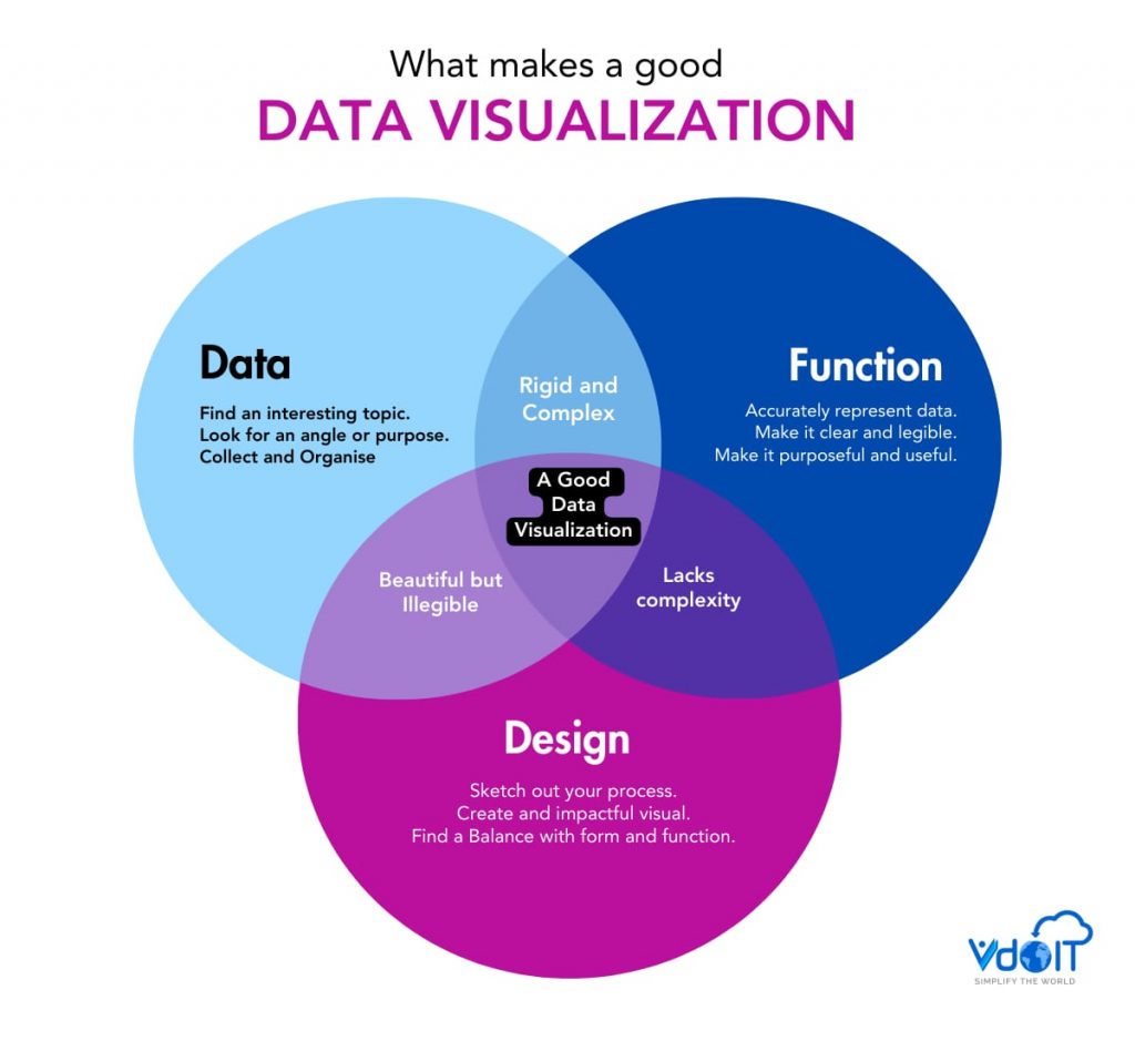
Advantages of Data Visualization Tools
Data visualization tools offer many advantages, transforming raw data into actionable insights and enhancing decision-making processes.
- First, these tools provide clarity and simplicity, translating complex datasets into visually appealing and easy-to-understand graphics.
- By presenting information visually, users can quickly grasp trends, patterns, and outliers, facilitating faster comprehension.
- Moreover, many data visualization tools allow users to explore data dynamically. Through filters, drill-downs, and other interactive features, individuals can delve deeper into datasets and gain a comprehensive understanding of the information at hand.
- This interactivity promotes a more engaged and explorative approach to data analysis, fostering a deeper connection with the underlying information.
- Data visualization tools aid in effective communication. Visualizations can tell a compelling story, making it easier for stakeholders to understand complex concepts.
- Whether it’s a sales report, market trends, or performance metrics, visualizations enhance communication by conveying information visually compellingly and memorable.
Disadvantages of Data Visualization Tools
While data visualization tools offer substantial benefits, users may encounter potential challenges. One key drawback is the risk of misinterpretation.
- Users might draw incorrect conclusions from visualizations without proper understanding or context, leading to misguided decisions. This underscores the importance of data literacy and ensures users can interpret visualizations accurately.
- Another challenge is the potential for information overload. As datasets grow in size and complexity, users may be overwhelmed with too much information.
- Designing clear and concise visualizations becomes crucial to prevent cognitive overload and ensure that users can extract meaningful insights without being inundated by data.
- Other than that, the effectiveness of data visualizations relies heavily on the quality of the underlying data.
- Inaccurate or incomplete datasets can lead to misleading visualizations, compromising the reliability of insights.
- Therefore, maintaining data integrity and ensuring the accuracy of the information being visualized is paramount for effective decision-making.
Data Visualization Trends 2024
While data visualization tools offer powerful means to uncover insights and communicate information effectively, users must be mindful of potential pitfalls. By fostering data literacy, designing clear visualizations, and ensuring data quality, organizations can maximize the advantages of these tools while mitigating potential disadvantages. The key lies in balancing the benefits of enhanced understanding and the need for accurate, contextualized data interpretation.
In 2024, advanced AI-powered data visualization tools will redefine the boundaries of what’s possible, leveraging technologies such as artificial intelligence and machine learning to unlock new realms of understanding. Whether uncovering hidden patterns, identifying emerging trends, or communicating complex concepts with clarity, these tools represent a paradigm shift in how we interact with data. As we delve deeper into the capabilities of these innovative solutions, we uncover a world of endless possibilities where data becomes not just a tool but a catalyst for transformative change.